English
English
Chinese (China)
Chinese (Hong Kong)
Indonesian
Malay
Polish
Portuguese
Spanish
Thai
Arabic
Tagalog
Vietnamese
Login
Home
App Marketplace
Product Guide
Training
Home
App Marketplace
Product Guide
Training
Contact Us
Home
App Marketplace
Product Guide
Training
Contact Us
Home
App Marketplace
Product Guide
Training
Contact Us
Understanding the Heatmaps display
Home
Product Guides
Maps
Heatmaps
Understanding the Heatmaps display
Understanding the Heatmaps display
Updated on September 5, 2025
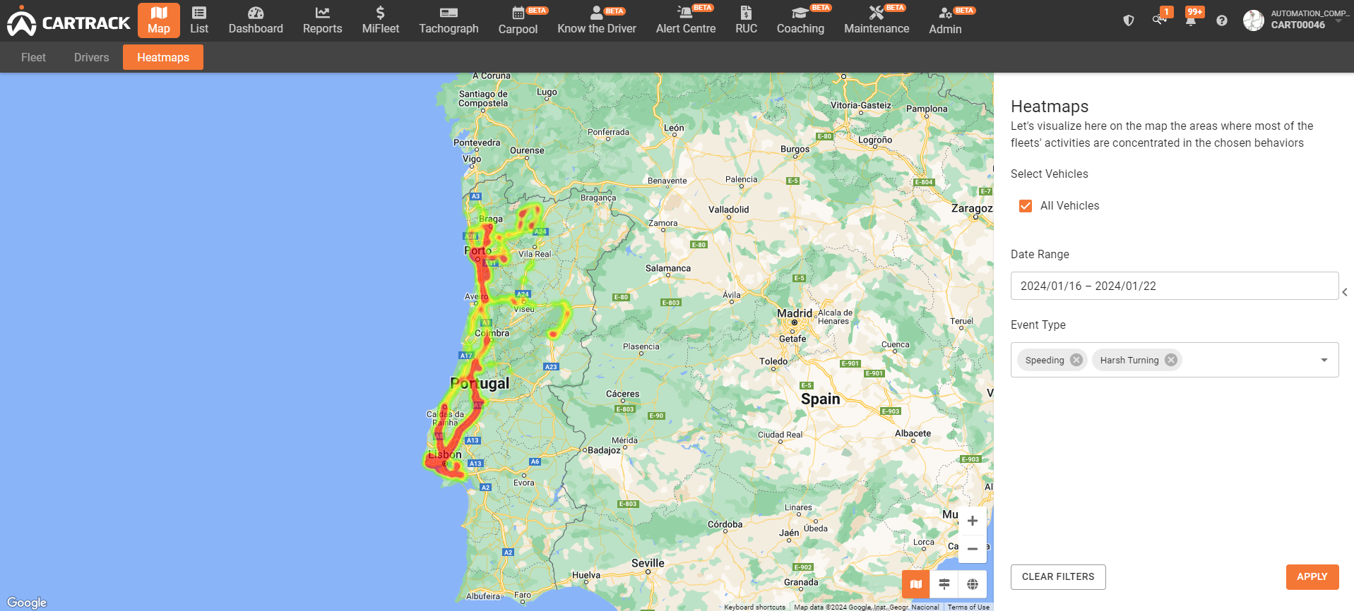
Colours: The Heatmaps results show event hotspots in different colours: red, orange, yellow and green
Red:
Indicates where events happen most often by the vehicles chosen during the selected time period.
Orange:
Indicates areas where high-risk events happen often but not as much as in the areas highlighted in red.
Yellow:
Indicates a less concentrated area where the selected events take place
Green:
Indicates areas that contain the least concentrated event activity.
No colour means that there is no activity.
Search criteria
Clearing or changing filter options
Was this article helpful?
Was this article helpful?
Answer
Yes
No
Email
Message
Consent
(Required)
We promise to play nice with your email address. See our
privacy policy
(Required)
CAPTCHA
Share This Article :
top
Simplifying IT
for a complex world.
Platform partnerships
AWS
Google Cloud
Microsoft
Salesforce